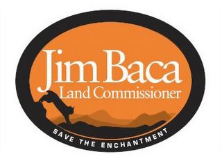
I have always felt it was important to have a logo for a political campaign. I am fortunate to have a name that fits nicely on any bumper sticker, yard sign, stationary, and lapel badge. Just seven letters in Jim Baca......It leaves room for other stuff.
This image is my campaign logo for my 2006 Land Commissioner Race. It was done by the genius folks at Vaughn Wedeen Creative in Albuquerque. They have done some beautiful work including the Albuquerque Isotopes logo. They are the best.
I told the artists what I envisioned. I wanted a Lynx in the picture since there is an effort underway to protect that cat in New Mexico. I have always liked them. I also had called a friend of mine on the Wilderness Society Council, Tom Barron and he described coming across a Lynx in Northern New Mexico not long ago while hiking. His verbal description of the encounter was dramatic and he was obviously moved. Tom is a well known author who writes under the name T.A. Barron. Follow this link to see more about this great writer.
Anyway, this logo says a lot about why I am running and I am very happy with it.
1 comment:
Actually, looking at it again, it looks almost exactly like the logo from the CBS show survivor: http://www.cbs.com/primetime/survivor12/
It's got the same main color, the same black border, the same white writing in the middle.
Yikes!!
Post a Comment